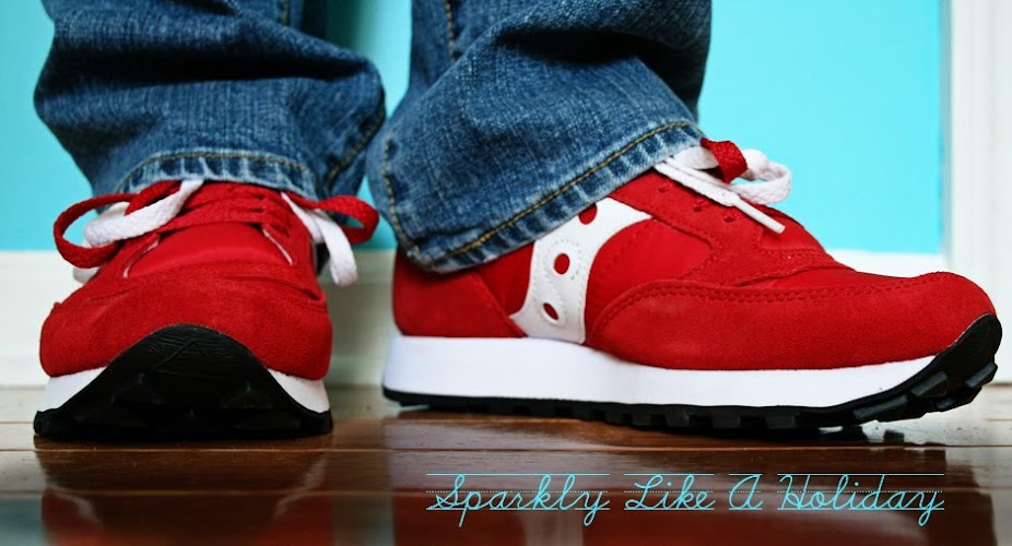
Red...which one is better?


This is one of my most favorite photos I've taken. I took it in downtown Valdosta and then bumped the contrast up a ridiculous amount so that the colors were crazy! I eventually cropped it and the second picture is what I have hanging in my living room...going back looking at the first one I still like how much of the wall is showing. But the more rectangular/cropped one seems to be less busy and all around better...guess that's why I cropped it---too much wall was too much. I think I definitely like the cropped one better, but can't make myself get rid of the first one. Which one do you like better and why?


0 comments:
Post a Comment